Monday, November 23, 2009

Tricky Art


Above you'll find the work of artist Rob Gonsalves. It's a great optical illusion that displays a large ship with full sails morphing into an aqueduct over the open seas. It's amazing what the eye sees depending on where it's focused.

Controlling the gaze of the viewer is just as much an art form as painting itself. Where do you want your viewer's eyes to go? Why? How will you do it? Contrast, lines, illusion -- all these methods and more should be in your box of design tools. Remember, you're not just making a thing, but a mediated experience, and it is your task to guide a viewer through that experience using your design principles along way to meet that end. Ultimately you can't make someone look right where you want them to, but the odds are in your favor if you consider the mechanics of the human eye and mind.

Population : One


Feast your eyes on Population : One, a website with one goal in mind: to put you in your place. It's hard to fathom being in a world with 6.5 billion other people, but that is the unbelievable case we find ourselves in. What's so unbelievable about that you ask? Well I think it's high time you had a visit to the site and found out.

It's a brilliant yet simple concept. Every pixel in the rainbow colored region of the site represents a human being on earth. Just keep on side-scrolling on through until your browser crashes or until you have a crash yourself. It's totally inconceivable.

This design is so simple, yet so effective. What an elegant way to represent something so huge. It really is important to keep in mind that sometimes -- most of the time really -- simplicity is king, and no substitutes need apply.

Logos with Great Use of Negative Space

Check out this rather amazing logo design that makes great use of negative space. Can you guess what A.G. Low does?

If you thought of a floor plan, you're on the right track -- they're a construction firm. It's amazing what a logo can communicate when designed thoughtfully.

There's a whole collection of these logos over at Logo Design Love, and they're all worth a look. There's a property maintenance logo that uses the negative space of an open-end wrench to make a house, or the Guild of Food Writers logo that hides the shape of a spoon in the tip of a fountain pen -- really creative stuff!

I've had a little experience trying to make cleaver logos like these, and it's really challenging work. As ever, the moral of the story is to try your very hardest to see what's between the lines and incorporate that into your designs too.

Image source: logodesignlove.com

Sunday, November 22, 2009

More on Bad Droid Marketing

I know I just got through making fun of Verizon's counter intuitive ad campaign for the new Motorola Droid, but their material seems to get worse and worse. This time, Verizon is taking direct aim at the iPhone by spoofing one of Apple's TV spots. Their commercial is called "iDon't, Droid Does," and it's a list of things the iPhone doesn't do, that android does. Great.

Anyway, the several people have already beat me to the punch and parodied that parody. Here is the best one of the bunch:

iDon't Care


That pretty much sums up everything I don't like about this style of marketing.

So far Verizon thinks they can threaten me into buying a HAL 9000 Droid, or that they can bash competitors, leaving themselves champion. I have news Verizon, we're smarter than that. I love the Droid, but why would I want one now? When you design an interaction between a company and a potential consumer base, don't make the cornerstone of the relationship negative jabs at the other guy. Make it positive. Goodwill goes a long way.

Moto Droid Adverts


What's the deal with the Motorola Droid's marketing? The last time I checked, no one wanted HAL 9000 in their pocket. I can imagine its users saying, "Voice command: call home." Only to be answered by Droid's omnipotent monotone, "I'm sorry, Dave. I'm afraid I can't do that." Whoever hired Arthur C. Clarke to be the marketing director for this project must have had their cognitive circuits disconnected.

Even the sounds it makes are a bit unsettling. Get a text? You'll hear a low robotic voice say, "Droid." Well crap, someone was texting you, Dave, but I guess Droid was hungry.

Now I know that Android 2.0 is great, and that this phone is really great -- Really -- but I just can't get the bad taste out of my mouth that some Verizon exec baked into this campaign. If you see a capsule drop out of the sky, land in a field, and start moving its sinister-looking mechanical aperture, make sure you run like hell -- I mean wait around for it to dispense great smartphones.

If you want someone to be scared of something, make it scary. If you want someone to love your product and carry it with them everywhere, I would plan on making it as kindhearted as possible; just short of painting rainbows on the case.

Mac OSX Home, End, Page Up, Page Down Keys

If there is one thing I've learned through my experience with Apple products, especially the iPhone, it's that no button goes wasted. If it doesn't need to be there, then it's not -- maybe not even if it does need to be there. So why are these four buttons, which are on every new Mac wired keyboard and many different models from different makes for the last thirty years, going largely unused under OSX?

As it stands their only function is to move the viewport of a window, and they don't even do that very well. Want to go to the very top of a long document? Hit the home key. Bottom? Hit end. Move up one viewport length? Page up. Down? Page down. Brilliant, we all get it.

But, the functionality of these keys is much more useful to the majority of the computing world, and even Mac users who fuss with their keybindings and install apps to bridge to non-cocoa-based apps. I'm talking about moving the cursor. The time I least want to fumble over to the mouse is when I'm typing, and that's exactly what I would have to do on a stock OSX build if I want to go to the beginning of a line of text, or select a section of text easily. If you want to move up to your last paragraph, get ready to hold the up arrow key, or grab your mouse, because Page Up is only going to confuse you when your window's viewport shift unexpectedly, instead of moving your cursor up, rather intelligently, to the previous body of text.

Apple's design principals have taught me a good deal about purposeful utilization of every feature of an object, but this discrepancy, that almost feels like a judgment for wanting something all-knowing Apple has wisely excluded, has me rethinking some of that. Maybe their version of utility isn't quite what mine is.

Saturday, November 21, 2009

Thinking Differently


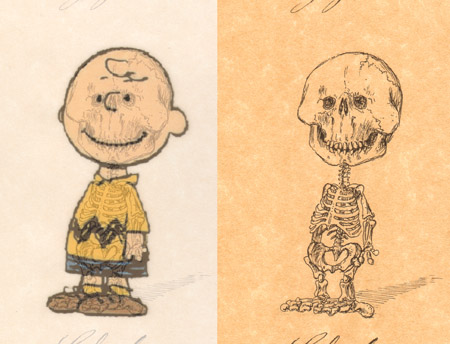
Check out this image collection from an exhibition of Michael Paulus's illustration series, Cartoons' Anatomy. I though these were really clever. Have you ever thought about Fred Flinstones' underpinnings? Uh, don't answer that. Michael Paulus has (in the best way), and the result is another inspiration to challenge the obvious.

Over think things! It might just lead you down a new and interesting path. It might even land you a gallery showing -- Who knows?

I find myself lost in minutia, while others around me are bored taking everything for face value. That might sound like a bad thing, but I have found that being obsessive can only help you make a better something. Embrace it, even if it means sketching the Powerpuff Girl's bones. Get lost in design that is lurking beneath the surface that we take for granted, or just don't even think about.

Image credit: uaddit.com