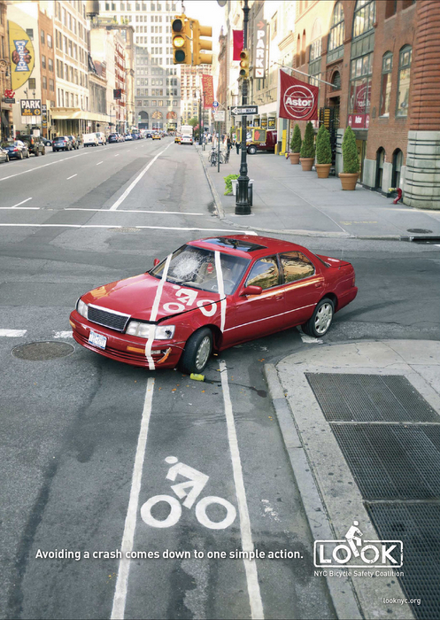
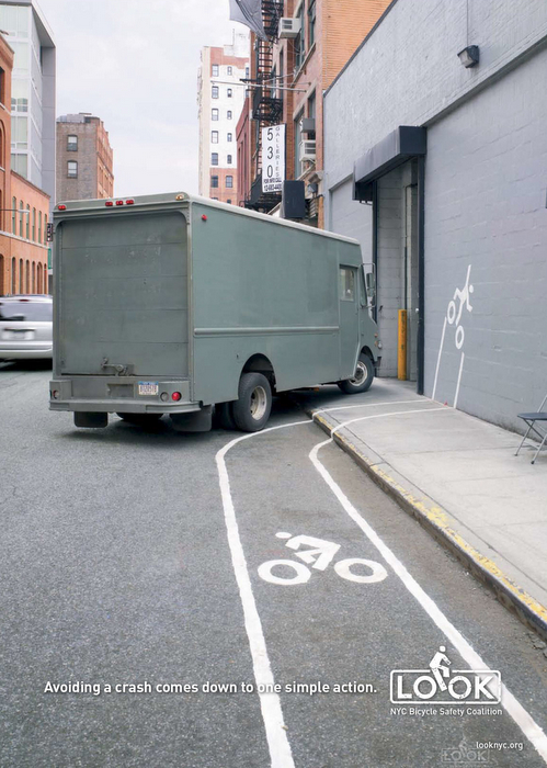
Without getting into my personal opposition to bike lanes, and my strong preference to practice vehicular cycling when appropriate (both of which I might just have to cover in another entry), I really thought these public service adverts by a NYC campaign Look were clever and timely given the increased number of bicycle commuters there, and increasingly across the nation.
It might be fair to say that these posters make light of a very real and serious problem that both cyclists and motorists face, but I really think these are elegantly subtle reminders for bike commuters to think defensively and to expect the unexpected.
The design of these posters is also quite inspirational to me. I try and keep an eye out for this kind of third-level meaning potential in everyday life, and I must say that this is a great example of just that. By painting cycling lanes places where they usually aren't, it tells a whole story to the observer that isn't altogether explicit or obvious. But, once you do get it, it's a very clear narrative that has a strong message that was communicated by imagery alone.
No comments:
Post a Comment