The Eyewriter from Evan Roth on Vimeo.
The Eyewriter is hardware and software project using openFrameworks, "an open source C++ toolkit for creative coding," that enables a paralyzed person to write and point by using their eye movements as control. It was originally created by Roth for a graffiti artist, by the call of TEMPT. It uses readily available and inexpensive consumer electronics to accomplish an amazing level of control over a computer illustration environment by just moving one's eyes. The software is calibrated to track the dark circle of the user's iris. The user can even remotely paint on buildings by using a projector to shine his work of their walls.
It's amazing what can be overcome with the right application of intellect, know-how, and a little bit of hardware hacking. I'm blessed to be free from any truly inhibiting physical conditions, but it's comforting to know that there are always ways to overcome difficulty and do what you love.
Monday, November 23, 2009

Unify iPhone Game
Unify Preview from zach gage on Vimeo.
Tired of conventional block-dropping games like Tetris, where blocks only come in from one side? I bring you unify. Instead of blocks only dropping in from the top and falling to the bottom, blocks come in from both sides and fall towards the middle. You use two fingers simultaneously to swipe pieces into position, and tap to rotate. If you want to speed things up a bit, just swipe the piece towards the center yourself.
The object is to keep the play area from getting totally blocked by grouping four or more blocks of the same color to make them disappear -- just like many block puzzlers. You can also earn combos by starting a chain of block groupings starting after you remove one group of blocks, and continued as the remaining blocks sift towards the middle. The most important difference remains the convergence of two opposing block streams that meet in the middle. It takes the challenge up quite a few notches, and looks like a lot of fun.
A seemingly simple design change has a really huge impact on the overall experience of this game. It just goes to show how crucial those initial brainstorming sessions are, and encourages me to think about aspects of interaction I may not have before.
Eigenlabs Eigenharp
 As the BBC article states, it really does look like something out of the bar scene with all the alien musicians in Star Wars, and it might be just that, really. This bassoon-looking instrument is the Eigenharp, and it's billed as "the most expressive electronic musical instrument ever made." It was initially thought up by John Lambert, software dev and musician alike, and he and his team have been taking steps towards making it a reality for eight years.
Lambert cites the stressful and all-around demanding nature of playing gigs with his whole rig to transport and set up. He compares his experience of playing with his ambient trance band to his solo fold gigs.
The gigs were really good fun, but the setting up was just a nightmare. Lots of stuff, equipment, wires, endless stress.
At the same time I would go to the folk club, take my acoustic guitar out of the box, tune it up, get a pint of beer, and play.
This was part of his inspiration for his new futuristic design. He now has all of the artistic control and expression he had with racks of synths, and the portability of his acoustic guitar, not to mention the ability to put on a more crowd-engaging live show.
Realizing that you can improve the way people do things through your designs is truly an empowering and inspirational thought. Think big and you'll see.
Image source: http://news.bbc.co.uk/2/hi/entertainment/8294355.stm
Single Ladies Cover Video
More video amazement coming your way, from more independent artist folk -- is there any other kind? Pomplamoose Music is a collaboration between Jack Conte and Nataly Dawn. Jack seems to run the recording and producing bits, from what I can tell, along with most of the instrumentation, and Nataly carries it home with her great voice and occasional bass guitar playing, clapping, and tambourine jangling (and thankfully since Jack looks a bit scary when tasked with playing the tambourine -- I don't think it's a coincidence that he's relinquished that responsibility on later videos). All joking aside, these two are amazing. Why they haven't decided to open a recording studio is beyond me. They are putting out an EP nowish though. Make sure to check out their YouTube channel for more great videos.
The thing I take away is that if you're ready to create, you can. Do it. For a couple thousand dollars you can have practically all the gear you need for pretty professional results.
Flip Book 2.0
VIDEOGIOCO by Donato Sansone from Enrico Ascoli - Sound Design on Vimeo.
Checkout this disturbing new approach to the common flip book. It's called VIDEOGIOCO by Donato Sansone from Enrico Ascoli Sound Design, and weird disembodied flying head antics aside, it a novel concept I have never thought of before. It is sort of a combination of stop motion cinematography, with more traditional illustrated animation, and maybe a bit of puppeteer action thrown in there for good measure. Oh, and maybe a flash of live action if you remember the brief real knife play.
Around 12 seconds in, you really see the full magnitude of the work that went into the illustration part of the project. Donato, or MILKYeyes as he refers to himself in the opening title, is totally surrounded by his creation. I wonder how he set up all the camera equipment, or even just moved around to flip the folds back and forth.
While I'm not sure this is a new genre, It's certainly is new to me, and it's nice to know that if you find yourself getting bored with what's out there, you can always redefine your media.
Checkout this disturbing new approach to the common flip book. It's called VIDEOGIOCO by Donato Sansone from Enrico Ascoli Sound Design, and weird disembodied flying head antics aside, it a novel concept I have never thought of before. It is sort of a combination of stop motion cinematography, with more traditional illustrated animation, and maybe a bit of puppeteer action thrown in there for good measure. Oh, and maybe a flash of live action if you remember the brief real knife play.
Around 12 seconds in, you really see the full magnitude of the work that went into the illustration part of the project. Donato, or MILKYeyes as he refers to himself in the opening title, is totally surrounded by his creation. I wonder how he set up all the camera equipment, or even just moved around to flip the folds back and forth.
While I'm not sure this is a new genre, It's certainly is new to me, and it's nice to know that if you find yourself getting bored with what's out there, you can always redefine your media.
Sharky Tea-Infuser
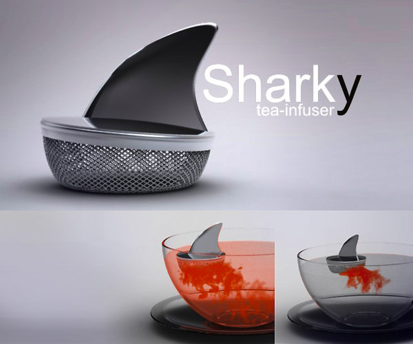
Meet Sharky. He is a tea-infuser that looks, well, like a shark -- a shark's fin to be precise. When you put him in your cup of hot water, instead of just steeping your tea, he hints at the visual idea of chumming out nasty bloody gook (provided you use right kind of tea, I'm sure). Fun!
Get a set of these, and try and make some friends that both love tea and Jaws and have yourself a shark movie marathon!
Designs like this should spice up some of the more boring parts of life, and if you don't find it at least a tad amusing, I think it's time for a vacation. Thankfully Thanksgiving is practically here (pun intended). This is going in my ever growing "thinking differently" file. Why make the everyday everyday? Great design is a refreshing thing, just like a good cup 'c tea.
Image credit: lookslikegooddesign.com
Impact of Design: Berners-Lee Apologizes for Design Excess

Tim Berners-Lee, god to any geek -- and more and more to anyone, has recently admitted that when designing the World Wide Web he went a bit slash crazy. He says that the two forward slashes following "http:" in every web address are "unnecessary."
There you go, it seemed like a good idea at the time.I'm glad to see that even the greats of our time can admit when they have over-designed something and created a huge time suck for everyone who uses it. Think about it. How many more seconds would the world have if everyone didn't spend the early days of the web fingering in those two extra characters. Then there's the impact that extra printing all those URLs made to be considered too. Tim, you have brought me the gift of information so I will always forgive thee, but thanks for fessing up anyway. I only hope that I can be so humble in my future career.
Source: http://news.bbc.co.uk/2/hi/technology/8306631.stm
Stokke Gravity Chair

All I want for Christmas is the Stokke Gravity Chair. It provides four different sitting positions, including fully reclined and forwarding leaning, simply by shifting your weight. I wouldn't be surprised if it was more comfortable than a La-Z-Boy, while still being able to pull of the title of task chair, and remaining relatively light and mobile.
The ergonomic benefits of changing your position throughout the workday are obvious, and I really love chairs that provide a place to kneel, but why is high design so high priced? At $2,400, I don't think I will be privileged enough to own one anytime soon, and good luck getting your boss to buy you one too.
Why are mass produced things often times the worst things? I don't claim to fully understand the economic demands on mainstream furniture designers, but I wish they produced more ground breaking concepts like this more often. Design for the everyman is bland and sad.
Tricky Art
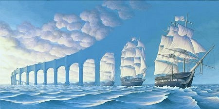
Above you'll find the work of artist Rob Gonsalves. It's a great optical illusion that displays a large ship with full sails morphing into an aqueduct over the open seas. It's amazing what the eye sees depending on where it's focused.
Controlling the gaze of the viewer is just as much an art form as painting itself. Where do you want your viewer's eyes to go? Why? How will you do it? Contrast, lines, illusion -- all these methods and more should be in your box of design tools. Remember, you're not just making a thing, but a mediated experience, and it is your task to guide a viewer through that experience using your design principles along way to meet that end. Ultimately you can't make someone look right where you want them to, but the odds are in your favor if you consider the mechanics of the human eye and mind.
Population : One

Feast your eyes on Population : One, a website with one goal in mind: to put you in your place. It's hard to fathom being in a world with 6.5 billion other people, but that is the unbelievable case we find ourselves in. What's so unbelievable about that you ask? Well I think it's high time you had a visit to the site and found out.
It's a brilliant yet simple concept. Every pixel in the rainbow colored region of the site represents a human being on earth. Just keep on side-scrolling on through until your browser crashes or until you have a crash yourself. It's totally inconceivable.
This design is so simple, yet so effective. What an elegant way to represent something so huge. It really is important to keep in mind that sometimes -- most of the time really -- simplicity is king, and no substitutes need apply.
Logos with Great Use of Negative Space
Check out this rather amazing logo design that makes great use of negative space. Can you guess what A.G. Low does?

If you thought of a floor plan, you're on the right track -- they're a construction firm. It's amazing what a logo can communicate when designed thoughtfully.
There's a whole collection of these logos over at Logo Design Love, and they're all worth a look. There's a property maintenance logo that uses the negative space of an open-end wrench to make a house, or the Guild of Food Writers logo that hides the shape of a spoon in the tip of a fountain pen -- really creative stuff!
I've had a little experience trying to make cleaver logos like these, and it's really challenging work. As ever, the moral of the story is to try your very hardest to see what's between the lines and incorporate that into your designs too.
Image source: logodesignlove.com

If you thought of a floor plan, you're on the right track -- they're a construction firm. It's amazing what a logo can communicate when designed thoughtfully.
There's a whole collection of these logos over at Logo Design Love, and they're all worth a look. There's a property maintenance logo that uses the negative space of an open-end wrench to make a house, or the Guild of Food Writers logo that hides the shape of a spoon in the tip of a fountain pen -- really creative stuff!
I've had a little experience trying to make cleaver logos like these, and it's really challenging work. As ever, the moral of the story is to try your very hardest to see what's between the lines and incorporate that into your designs too.
Image source: logodesignlove.com
Sunday, November 22, 2009
More on Bad Droid Marketing
I know I just got through making fun of Verizon's counter intuitive ad campaign for the new Motorola Droid, but their material seems to get worse and worse. This time, Verizon is taking direct aim at the iPhone by spoofing one of Apple's TV spots. Their commercial is called "iDon't, Droid Does," and it's a list of things the iPhone doesn't do, that android does. Great.
Anyway, the several people have already beat me to the punch and parodied that parody. Here is the best one of the bunch:
iDon't Care
That pretty much sums up everything I don't like about this style of marketing.
So far Verizon thinks they can threaten me into buying aHAL 9000 Droid, or that they can bash competitors, leaving themselves champion. I have news Verizon, we're smarter than that. I love the Droid, but why would I want one now? When you design an interaction between a company and a potential consumer base, don't make the cornerstone of the relationship negative jabs at the other guy. Make it positive. Goodwill goes a long way.
Anyway, the several people have already beat me to the punch and parodied that parody. Here is the best one of the bunch:
iDon't Care
That pretty much sums up everything I don't like about this style of marketing.
So far Verizon thinks they can threaten me into buying a
Moto Droid Adverts

What's the deal with the Motorola Droid's marketing? The last time I checked, no one wanted HAL 9000 in their pocket. I can imagine its users saying, "Voice command: call home." Only to be answered by Droid's omnipotent monotone, "I'm sorry, Dave. I'm afraid I can't do that." Whoever hired Arthur C. Clarke to be the marketing director for this project must have had their cognitive circuits disconnected.
Even the sounds it makes are a bit unsettling. Get a text? You'll hear a low robotic voice say, "Droid." Well crap, someone was texting you, Dave, but I guess Droid was hungry.
Now I know that Android 2.0 is great, and that this phone is really great -- Really -- but I just can't get the bad taste out of my mouth that some Verizon exec baked into this campaign. If you see a capsule drop out of the sky, land in a field, and start moving its sinister-looking mechanical aperture, make sure you run like hell -- I mean wait around for it to dispense great smartphones.
If you want someone to be scared of something, make it scary. If you want someone to love your product and carry it with them everywhere, I would plan on making it as kindhearted as possible; just short of painting rainbows on the case.
Mac OSX Home, End, Page Up, Page Down Keys
 If there is one thing I've learned through my experience with Apple products, especially the iPhone, it's that no button goes wasted. If it doesn't need to be there, then it's not -- maybe not even if it does need to be there. So why are these four buttons, which are on every new Mac wired keyboard and many different models from different makes for the last thirty years, going largely unused under OSX?
As it stands their only function is to move the viewport of a window, and they don't even do that very well. Want to go to the very top of a long document? Hit the home key. Bottom? Hit end. Move up one viewport length? Page up. Down? Page down. Brilliant, we all get it.
But, the functionality of these keys is much more useful to the majority of the computing world, and even Mac users who fuss with their keybindings and install apps to bridge to non-cocoa-based apps. I'm talking about moving the cursor. The time I least want to fumble over to the mouse is when I'm typing, and that's exactly what I would have to do on a stock OSX build if I want to go to the beginning of a line of text, or select a section of text easily. If you want to move up to your last paragraph, get ready to hold the up arrow key, or grab your mouse, because Page Up is only going to confuse you when your window's viewport shift unexpectedly, instead of moving your cursor up, rather intelligently, to the previous body of text.
Apple's design principals have taught me a good deal about purposeful utilization of every feature of an object, but this discrepancy, that almost feels like a judgment for wanting something all-knowing Apple has wisely excluded, has me rethinking some of that. Maybe their version of utility isn't quite what mine is.
Saturday, November 21, 2009
Thinking Differently
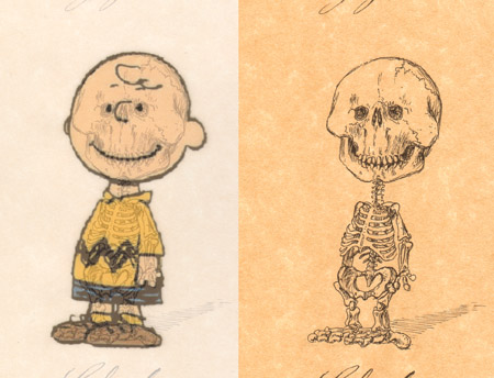
Check out this image collection from an exhibition of Michael Paulus's illustration series, Cartoons' Anatomy. I though these were really clever. Have you ever thought about Fred Flinstones' underpinnings? Uh, don't answer that. Michael Paulus has (in the best way), and the result is another inspiration to challenge the obvious.
Over think things! It might just lead you down a new and interesting path. It might even land you a gallery showing -- Who knows?
I find myself lost in minutia, while others around me are bored taking everything for face value. That might sound like a bad thing, but I have found that being obsessive can only help you make a better something. Embrace it, even if it means sketching the Powerpuff Girl's bones. Get lost in design that is lurking beneath the surface that we take for granted, or just don't even think about.
Image credit: uaddit.com
Time Juxtaposed

In the past months, it seems like social networking services have been flooded by posts related to photos-in-photos that depict that same place during two very different times. Without much need for explanation, this concept is really humbling. All of us have probably stopped to think about who has occupied the spaces we now inhabit, but this has to close to the ultimate extension of that sort of pondering.
Hats off to the photographers that do the research that makes these dramatic historical juxtapositions possible. You can find the image above and more like it here. When I first started seeing this concept, they were commonly scenes of war-shaken town centers, and how they've been restored. I think this set might have something more to offer. It's fascinating to me how time changes everything, but it happens so slowly that it's hard to see. This particular group of images offers a sort of super-human ability to see into the past.
Lately I've been on a bit of an existential time trip asking questions like, "Who's thought of that? Or, why didn't they do this? Where would we be if this was never created?"
I wonder if the lady on that bench wondered the same thing.
Image source: woa2.com
Gumuz Word Clock

Behold the Gumuz Word Clock. See it in action here. It's pretty clever, if not all that original. Instead of representing the time the way me might traditionally, with hands and numbers, this clock is using words that illuminate to write the time as most of us would speak it. Now, while this design does limit its minute resolution to five minutes, I still think this concept would make for a great addition to a casual, leisure time space, where five minute resolution seems like looking at the space time continuum with a microscope.
This clock is in keeping with my continuing aim to challenge the commonplace, and there are few things more common than the humble clock. Why should commonplace be boring? The things we use every day, should be the objects with the most care taken in their design. Without trying to sound like an out of control consumer, replace the things around you that don't make you smile. Don't waste an opportunity to be inspired by good design.
Source: gumuz.nl
Vessel Workplace Dish Set

Take a look at this all inclusive and all-around clever design by Vessel. It's their Workplace Dish Set (currently back-ordered, and for good reason). It puts place mat, flatware set, plate, bowl, and cup all in one neat and secure bundle that is ready to be grabbed and taken back to your work cave to help you eat up.
Here are some additional images to give you a better idea of how it pulls all that off:


Now, while I'm fairly certain that no one really enjoys staying in the office for lunch, this set might just make the experience a bit more palatable.
This whole package got me thinking of how items that are associated with each other, should really be bedfellows so they're always ready to go when we are. Want to pack up your music and bring it along? You could grab your portable and a pair of tangled headphones, or you could apply this principle and have your player all ready to go inside of a case that both protects it and stores the earphones securely and neatly.
Image credit: vessel.com
Longevity of Design: History of the Coca-Cola Bottle

I came across this collection of Coke bottles this Tuesday, and I can't seem to stop thinking about them. Their transformation speaks volumes about the technology, and even the culture, of each era. From the first bottle, my personal favorite, with cork stopper and extra thick glass walls, to the modern sculpted one with a metal bottle cap and screen printed label. They all tell a story about the age they served. An aside, I was a bit baffled to find that green glass was only used in one generation of the bottles -- my favorite color happens to be coke bottle green, and I was shocked to see that it's not really the prevalent color for the brand, from a historical standpoint.
As a designer, this image gets me thinking about the legacy we leave behind when we create things. I think about how my creations correspond with what came before them, and perhaps how they don't; how they make something new, or how they just tweak what was already there and take it a step closer to perfection; or how they lay the footwork for the next designer to be inspired and say something new, or how it allows them to just say the same thing with a more modern voice. When I look through these bottles I have a very changed perspective about the scope of what designers do. I think that’s why I keep coming back to this image day after day.
Image source: ubersuper.com
Confirmation Bias
Sure counting words has its place, and it can be a very revealing information gathering tool, but as linguist Geoffrey Nunberg points out in his piece "The I's Don't Have It" that aired on NPR last Tuesday, "counting words isn't very revealing if you aren't listening to them too." The internet makes everyone a linguist, and everyone is trying to find fault in the new health bill or the most recent political speech. But, are people blindly counting I's and finding everyone to be a narcissist when really they're using an imperial I to show deference? The media seems to be suffering from confirmation bias. If they're looking to support an opinion, they will find evidence.
Sometimes I feel as though I suffer from confirmation bias in my designs. Do I do it this way because it's more usable, or just because everyone does it that way -- making it more familiar and easier on new users? Stand behind your design decision and don't do what's commonplace or easy. Do what makes the most sense.
Sometimes I feel as though I suffer from confirmation bias in my designs. Do I do it this way because it's more usable, or just because everyone does it that way -- making it more familiar and easier on new users? Stand behind your design decision and don't do what's commonplace or easy. Do what makes the most sense.
Subscribe to:
Posts (Atom)